Case Study
One Ally Design Strategy
When Ally launched its "One Ally" initiative to unify platforms and infrastructure, I saw an opportunity to address an equally important challenge—our fragmented customer experience. While the technical work would take years to complete, I believed we could start defining what a unified experience should look and feel like immediately. This case study shows how I turned a primarily technical mandate into a broader conversation about customer experience quality and consistency.
Ally’s CEO committed the company to an ambitious enterprise-wide technology and data platform consolidation initiative under the banner of "One Ally."
Complication
Years of acquisition-driven growth, geographic expansion, and siloed product operations led to inconsistent experience design across Ally’s digital touchpoints.
Resolution
I co-opted the technology mandate to resolve longstanding design debt while building a coalition of product teams behind new standards of quality and consistency.
Outcome
A near-term design debt remediation roadmap, and a long-term shared commitment to a more coherent, “One Ally” standard for digital user experience design.
This case study documents a pre-pandemic, in-person approach to building consensus for design quality. By creating a physical installation of our digital ecosystem, I helped teams see the bigger picture beyond their individual products. The result was both practical and strategic—a prioritized plan to fix existing issues and a framework to guide future work.
Stages:

AI audio overview (11 minutes)
Listen to a deep dive on this case study from Google's NotebookLM
Opportunity
CEO Mandate as Design Catalyst
When Ally’s CEO announced the ambitious “One Ally” initiative to unify our technology and data platforms, it signaled more than just an IT project. The mandate was meant to break down silos in systems, but it also presented a chance to unify the customer experience. If we were going to have one integrated Ally platform, we needed one integrated Ally design to match.
Our starting point was a fragmented digital ecosystem born of rapid growth. In the years after Ally rebranded from GMAC in 2009, the company expanded through new offerings and acquisitions. This meant multiple product teams working on different tech stacks, each optimizing for their own deadlines and needs. While our flagship online banking site won awards, other customer touchpoints had drifted out of sync. It was hard to blame anyone—teams had prioritized speed and business continuity over pixel-perfect consistency when scaling up. The result, however, was an inconsistent user experience across products.
The “One Ally” vision gave us permission to tackle this long-standing gap. Rather than wait for the multi-year back-end consolidation to gradually improve the front-end, we decided to start immediately by defining what a unified Ally experience should look and feel like. This was an opportunity to address our accumulated design debt and align every digital product with a coherent experience. In short, a primarily technical mandate became our catalyst to elevate design as a strategic priority for the business.
The long arc of this effort eventually showed up in Ally’s most visible digital property. In 2023, I was leading designers responsible for the mobile app experience—helping shape the next generation of Ally’s app in alignment with the One Ally strategy. That work went live in early 2024, shortly after I left the company, and was featured in a behind-the-scenes post on Ally’s tech blog: Ally’s Mobile App Gets a Refresh ↗
Discovery
War-Room Analysis Reveals Gaps
To kickstart the effort, we turned our design studio into an immersive war room. We printed screenshots from every customer journey and every product—covering everything from public sales pages to logged-in account dashboards. These prints, organized by product line and blown up to poster size, covered an entire wall and created a living map of Ally’s digital ecosystem for all to see.
The effect of seeing everything at once was eye-opening. Digital products that normally lived in isolation were now tangible artifacts sharing one space. By literally breaking out of the screen, we transformed abstract user interfaces into a concrete exhibit of our portfolio. Patterns (and problems) that were easy to overlook in silos became painfully obvious when laid side by side. Visual inconsistencies that had been hiding in plain sight were now impossible to ignore.
Heuristics, Not Aesthetics
With this wall as our single source of truth, I convened cross-functional deep-dive sessions to analyze the experience. Designers led a heuristic review of each screen—scrutinizing clarity, consistency, ease of use, and accessibility with engagement from product managers and developers from each product team. Importantly, we focused on fundamental usability principles rather than personal design preferences. For example, we flagged things like inconsistent terminology and missing confirmation messages over mismatched colors or fonts. This kept the discussion grounded in improving functionality and user understanding, rather than debating aesthetics.
These collaborative wall walk critiques were candid and constructive. Rather than waste energy finger-pointing over things we weren’t proud of, I kept the sessions forward-focused steering attention toward the business case for turning bad experiences into good ones. I made it easier for all to see where our product experiences fell short, and just as easy for all to articulate why and what it means—not who’s to blame. We used color-coded sticky notes to mark hundreds of issues and opportunities directly on the screenshots, using a simple organizing framework to keep our analysis consistent:
Simple & Fast
Making things easy to use (orange stickies)
Consistent & Direct
Clear communication of value (blue stickies)
Flexible & Inclusive
Meeting users where they are (purple stickies)

This kept the focus on core usability and experience principles that everyone could understand, regardless of discipline. At the same time, we highlighted a few shining examples where everything came together perfectly, to illustrate what “good” looked like. By the end of this discovery phase, the team had a clear, shared view of the gaps between our best-in-class moments and the disjointed parts of the user journey.
This effort not only uncovered where our user experience needed improvement, it also built a sense of shared purpose. Standing shoulder to shoulder in front of the evidence created mutual understanding and buy-in. It set the stage for a two-track response: one track to immediately start fixing the most critical design issues, and another to capture our insights in a lasting design framework for the future.
Expediting Quick Wins
Among the early quick wins identified in our cross-functional analysis were merchandising pages where minor adjustments could yield major improvements in engagement. Far from cosmetic critiques, we made functional observations that zeroed in on strengthening the top of the funnel. In one representative example (figure 1), we scrutinized a product landing page that suffered from common yet consequential issues: disconnected messaging between rate offers and value props, poor link visibility, and cluttered CTAs. Even the layout introduced a false bottom that could inhibit further engagement by scrolling. Without changing the campaign aesthetic, we sought to improve legibility, alignment, and momentum—small changes that could remove friction and encourage deeper exploration.
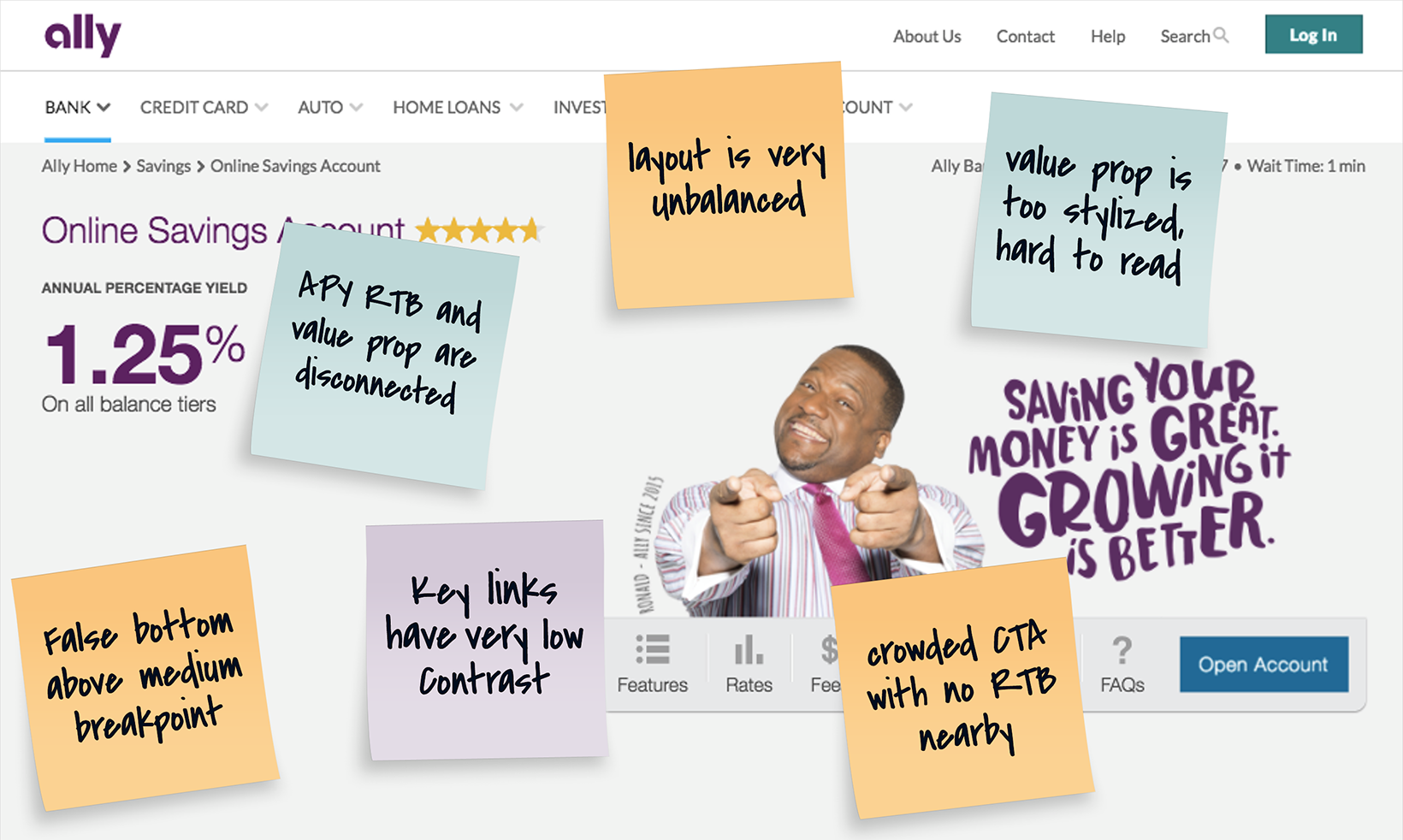
Figure 1 — Example Observations
Scrutinizing the Sales Funnel
Simulation of an annotated product merchandising page, one of many that were actually scrutinzed during heuristic evaluation. Issues identified included unbalanced layout at large breakpoints, low-contrast navigation links, a stylized and hard-to-read value proposition, and a crowded CTA block with no adjacent reinforcement of the offer or reasons to believe. A false bottom above the fold further risked stalling engagement. The goal in this and similar cases was to increase clarity to drive customer engagement, conversion, and retention without disrupting the visual language of the design system or—as in this merchandising instance—brand campaign.
Remediation
Prioritizing Design Debt Collaboratively
Armed with a wall full of insights, we turned to remediation. We had cataloged over 300 discrete issues, from minor copy inconsistencies to major usability hurdles. To make meaningful progress, we needed to focus on the right fixes first—those quick wins. I applied a simple scoring model to evaluate each issue on two axes:
Impact
How strongly it affected users and business outcomes.
Complexity
How difficult it would be to fix given technical constraints
Strategically, I engaged product managers to drive prioritization using a procedure that involved a series of objective questions about every issue in their domain. Questions like:
- Which customer segment sees this?
- Does it occur at a key step in the funnel?
- Is it a surface fix or deep in the tech stack?
This gave us a fact-based way to sort the signal from the noise. Take, for example, weighing a confusing top of funnel value prop against a confusing piece of contextual help on a niche page. From an impact perspective, the difference in ROI is signficant, and the algorithm in the worksheet would reflect this, automatically determining which to prioritize first.
Depending on the context, there were as many as 9 questions in the worksheet for each defect. Each question mapped a weighted value to either an impact or complexity score. Together, these values calculated to form a composite score which determined a defect’s relative priority.
Prioritization =
Average Impact
Average Complexity
In practice, the people closest to each product were quantifying the pain points themselves through this process. We even allowed a slight manual adjustment if someone felt the scoring missed a nuance, but interestingly PMs rarely used this override. The scoring model logic was transparent and made sense to everyone.
The result was a clear, shared remediation roadmap to reduce our design debt. Every issue was plotted on the same impact-versus-effort matrix across all products, and we grouped fixes into waves. We attacked the high-impact, low-effort wins first to build momentum. Because the prioritization was done collaboratively (not handed down from design), teams embraced the plan. This collaborative approach turned a daunting laundry list of fixes into an actionable plan that had buy-in from all stakeholders.
Small Moves With Big Results
One of the first product areas to be remediated was the same merchandising page highlighted earlier (figure 1). Working within existing brand constraints, we introduced targeted adjustments (figure 2): a balanced layout, integrated value prop messaging, an uncluttered CTA, high-contrast supporting links, and a subtle visual cue to encourage scrolling beyond the fold. These weren’t sweeping design changes—they were surgical, insight-driven refinements.
When evaluated through an A/B test against the legacy version, the results were unequivocal.
- Click-throughs rose ↑ 59%.
- Conversions increased ↑ 24%.
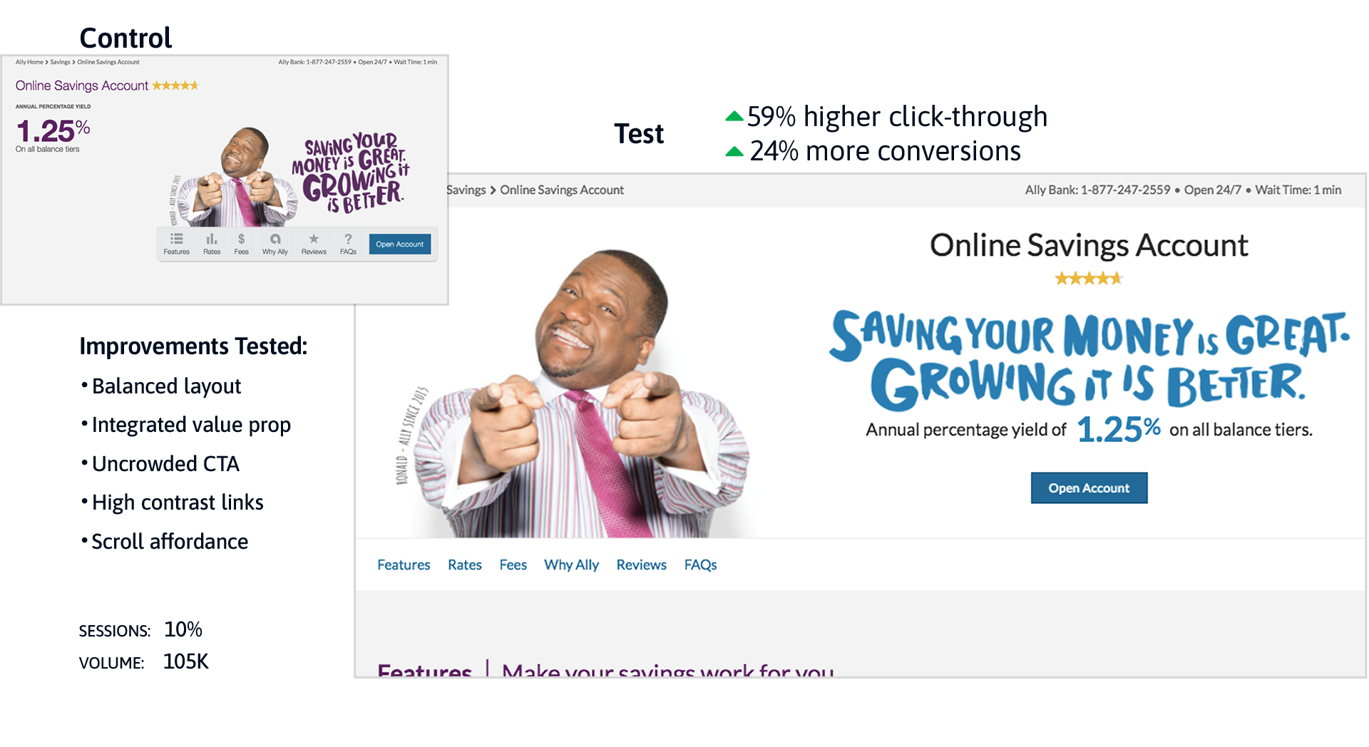
Figure 2 — Targeted Adjustments
Remediating Quick Wins
Post-remediation performance from an A/B test of the revised merchandising page hero cited earlier (prioritized as high impact, low complexity). Improvements included a more balanced layout, integrated value prop messaging, an uncluttered CTA block, higher-contrast links, and a clear scroll affordance. Compared to the legacy version, the test variant achieved a 59% increase in click-throughs and a 24% increase in conversions—with 99% statistical confidence across 105K sessions.
Just one example of the exceptional outcomes achieved through this collaborative, cross-functional approach to experience design.
Exhibition
Putting Things in Perspective
Getting the wheels of remediation in motion would take more than just calling out design debt and deeming it a priority. That’s not how things work in an enterprise environment. For the concern to be shared, each case must be made to the right stakeholders—the ROI calculated and scrutinized. There would be release plans to negotiate, and backlogs to reconcile; minds to change. It would take a disruption of some kind to get everyone looking in the same direction and believing in the same mission.
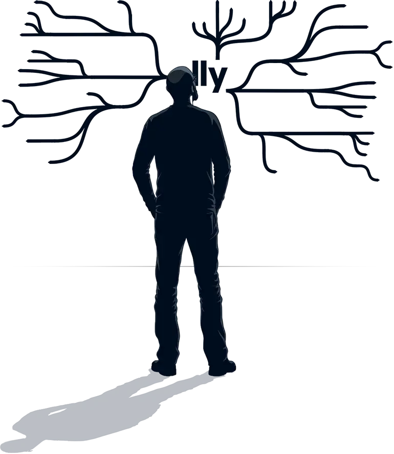
Rather than take down the wall of sticky noted screens after completing our prioritization, I transformed the research into a floor-to-ceiling exhibition that made the case for change impossible to ignore. I expanded the initial war room setup into a curated installation along our longest wall in the studio. At one end I mounted a massive, 8-foot by 5-foot mind map diagram illustrating the full scope and complexity of Ally’s digital ecosystem. This was for effect, not just reference. It commanded attention, and immediately instilled a much-needed sense of perspective for every stakeholder who stood before it. The message it conveyed was unmistakable: each product—their product—was but a branch on a limb of a very big tree.
Humbled by the complexity, their perspective would sharpen even more with the next piece in the exhibit: a brand alignment continuum that mapped the good, the bad, and the ugly among every customer-facing product in the Ally portfolio. Similar in size to the giant mind map, we used this part of the wall to rank UIs by quality and brand consistency, from best to worst. Arranged left-to-right, desktop and mobile screens were mapped from “Target State” (green) through “Inconsistent” (amber) to “Off Brand” (red).
20+ Desktop Screens
Target State
Inconsistent
Off-Brand
20+ Mobile Screens
This visual spectrum made the quality gap unmistakable. Screens our design team had proper influence on were anchored to the left in green, while those developed outside our standards drifted rightward into the red. The display led to some uncomfortable but necessary conversations when teams saw their products falling on the wrong side of the spectrum. This was by design to set the tone for a constructive dialogue about aligning to a “One Ally” standard—the target state—in the next part of the exhibit.
Occupying a majority of the space in this installation were vertical deep dives into each product experience on tabloid-size paper. This was the main attraction—over 80 printed screens with digitized sticky note annotations highlighting nearly 300 improvement opportunities. Organized by product as flip-boards spanning the length of our longest wall, this setup allowed people to physically engage with each customer journey, turning pages, and taking in the critical observations annotated previously by the product teams.

This tactile and immersive experience created an emotional resonance that a slide deck on a screen could never achieve. Walking along the wall, stakeholders could tangibly sense the inconsistencies and missed opportunities. In one glance you might appreciate the state-of-the-art in digital customer experience through an Ally Bank UI, then confront an awkward, outmoded product example where the UI is still anchored in antiquated technology and legacy business operations that compromise design and erode the brand. Two very different representations of Ally; concrete and visceral by design.
It sparked honest, often uncomfortable reactions right on the spot. But because everyone was looking at the same unfiltered truth, the question was never “So what?” or “Who did this?”, it was always…
“How do we fix this, and make sure it never happens again?”
I regularly invited teams and executives for informal walkthroughs of the installation; dozens of them over weeks and months. Rather than a formal presentation, these sessions were always improvised and very hands-on with the intent of driving real conversations that lead to real progress. People would step up to the wall, flip through the pages, and point out issues or ask questions.
As we discussed what we were seeing, I steered the conversation toward business outcomes instead of subjective opinions. For example, a confusing form wasn’t described as an “ugly screen” – I described it as a point of friction that impedes conversion, adoption, or retention, and costs us revenue. An off-brand page wasn’t just a style miss – it was a risk to our brand trust and a cause of unnecessary support calls. By tying design issues to metrics and business pain points, I got nods from the executives in the room. The wall became a powerful catalyst for alignment. Stakeholders from every corner of the enterprise could now see and agree that fragmented design was more than a cosmetic problem; it was a business risk.
Not surpirisngly, the exhibit became a major point of interest as a reference point for planning and decision-making about how and when to move from red to green. This buzz and peer influence did as much to build urgency as any formal report could. In the end, the physical installation wasn’t just a showcase of problems—it was an open invitation to be part of the solution, and it succeeded in rallying broad support for our design unification effort.
Framework
Codifying Principles into a Playbook
While we worked on negotiating quick wins and medium range plans, we also knew we needed to prevent the same fragmentation from happening again. In parallel, I led the creation of a long-range strategic design framework—essentially a playbook of standards that would guide all products toward a cohesive “One Ally” experience moving forward. We distilled the patterns and decisions from our wall analysis into a playbook of clear design principles and guidelines.
First, we established a few universal experience principles that applied to any customer journey (for example, guidelines around simplicity, clarity of communication, and mobile-first accessibility). Then, we got more granular by outlining specific standards for each major customer journey we had identified. We recognized that opening a new account has different UX considerations than applying for a loan or managing an existing account, so the playbook provided both general principles and context-specific best practices.
We made sure this framework was practical and co-created, nothing esoteric or theoretical; just sensible and objective digital experience principles. The same product teams who helped spot the issues contributed to refining the guidelines, which gave the standards an intrinsic familiarity and appeal that accelerated adoption. Once we had a solid draft, we published the playbook primarily as a digital resource integrated directly into our design system library for reference and implementation.
However, I recognized that digital-only resources, while functional, can sometimes fade into the background of busy workflows. To symbolize the permanence and importance of this shared commitment, I also created physical artifacts—hand-bound playbooks that I personally assembled for each product manager, designer, and developer. These weren’t meant to replace the digital working version but rather to serve as tangible reminders of our collective pledge to uphold these standards.
When handed directly to team members and incorporated into new hire onboarding, these playbooks became powerful symbols of our investment in a unified experience. The message was that consistency and quality were now a shared language across Ally. No matter which product or feature someone worked on, they had a common reference for what a great Ally experience looks like. This framework became the blueprint to keep our design decisions aligned long after the exhibit came down.
Accountability
Shared Responsibility and Ongoing Audits
Having a plan is one thing; executing it over time is another. From the start, I wanted to ensure our new standards and fixes would stick. To keep teams accountable, we scheduled a follow-up Design Readiness Audit to take place 18 months later. This was essentially a structured check-in on how well each product had aligned with our One Ally standards. Staying true to our collaborative approach, the audit was not a top-down inspection – instead, each product team was given a rubric to score their own user experiences against the playbook’s criteria.
The follow-up audit served two important purposes:
1. It measured progress: we could celebrate areas where the customer experience had significantly improved and flag places where inconsistencies still lingered.
2. It reinforced consistency as an ongoing commitment, not a one-time project. Knowing that an audit was coming kept everyone focused on maintaining the standards in their day-to-day work, not just fixing things in a one-off burst.
By making every team explicitly responsible for upholding the shared design principles, we baked lasting accountability into the culture. Even after the fanfare of the initial initiative faded, this regular audit cycle would help maintain momentum and keep the quality bar high across all our digital products.
Legacy
Lasting Impact and a Unified Future
The technology unification behind “One Ally” would ultimately span several years, but our early focus on design ensured we didn’t have to wait to see benefits for customers. By tackling design cohesion first, we gave teams practical guidance they could use immediately, even on legacy platforms. In effect, this initiative bridged the gap between a fragmented past and the seamless future we envisioned. By the time the new unified systems rolled out, a lot of the customer-facing polish was already in place – we weren’t starting from scratch, because the experience vision had been clearly defined and partly implemented ahead of the backend overhaul.
More important than any single UI fix was the shift in mindset that came out of this effort. We fundamentally changed the conversation about design at Ally. Through this initiative, we changed the conversation about design at Ally from a service function that delivered outputs to a more strategic and collaborative discipline that helped shape outcomes. Design earned a seat at the table as a strategic, cross-functional partner, as leaders saw first-hand how customer experience consistency could reduce confusion, build trust, and drive value.
What began as a wall of screens became a mirror—and then, a map. The framework that emerged, and the collaborative spirit that defined it, would shape product design at Ally for years to come.
More case studies
A knowledge engine for the AI era—how I transformed theoretical frameworks into a knowledge engine for strategic growth.
Short case studies in design leadership demonstrating the range of impacts I have had over more than two decades in the field.
A framework for matching talent to impact, where aligning temperament with task drives confidence and performance.
A case of community impact at scale—follow how I architected a digital strategy for economic mobility in Charlotte.
Using everyday metaphors to elevate teams—explore how I build shared understanding around quality and excellence.

Rockturn is a knowledgebase for digital product design. Find your next wave.
search suggestions
Dive right in!